-
Bug
-
Resolution: Fixed
-
High
-
8.0.0, 8.19.8
-
Severity 3 - Minor
-
2
-
-
Accessibility
Issue Summary
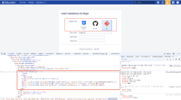
The form for importing a repository contains a group of three buttons for selecting the repository source. However, these buttons do not have the appropriate accessibility attributes.
Steps to Reproduce
- Activate this URL - https://instenv-385312-d344.instenv.internal.atlassian.com/plugins/servlet/import-repository/ROG#landing-page
- Navigate to repository
- Navigate to the repository import form.
- Attempt to select a repository source using assistive technology.
- Observe that the selection is not perceptible via screen readers and other assistive technologies.
Screenshot
Screen Recording
Actual Results
The selection of the repository source is represented by three visually styled buttons. However, the selected button is indicated only by a CSS class (.active), which is not detectable by screen readers or other assistive technologies.
The buttons are not defined as input elements (e.g., radio buttons) or assigned roles (such as role="radio"), leaving users without a way to understand their functionality.There is no auditory feedback provided to users about the current selection, and assistive technologies cannot programmatically determine the selected option.This made it difficult for the screen reader users to interact with the custom radio buttons.
Expected Results
Proper Role Definition: The group of buttons should be marked with a proper role, such as role="radiogroup", and each button should have a role="radio" attribute. This will allow assistive technologies to recognize that the buttons represent a mutually exclusive selection group.
Programmatic Indication of Selection:
The selected button should include an aria-checked="true" attribute, and non-selected buttons should have aria-checked="false". This will clearly communicate which option is currently active to users of screen readers.
Accessible Labeling:
Each button should have a corresponding label to describe its function (e.g., “Bitbucket Cloud” or “GitHub”), using either the label element or aria-label attribute.
Keyboard Accessibility:
Ensure that users can navigate between the buttons using keyboard shortcuts, with focus states and selection changes being announced to screen readers.
Code snippet
<div class="field-group" role="radiogroup" aria-labelledby="import-from-label">
  <label id="import-from-label">Import from<span class="aui-icon icon-required"></span></label>

  <button type="button" class="aui-button" role="radio" aria-checked="false"  data-source="BITBUCKET_CLOUD">
    Bitbucket Cloud
  </button>

  <button type="button" class="aui-button" role="radio" aria-checked="false"  data-source="GITHUB">
    GitHub
  </button>

  <button type="button" class="aui-button active" role="radio" aria-checked="true"  data-source="GIT">
    Git
  </button>
</div>
Workaround
Currently there is no known workaround for this behavior. A workaround will be added here when available
Environment
MacBook Pro (16-inch, 2019)
macOS 13.4.1 (c) (22F770820d)
Chrome - Version 115.0.5790.170 (Official Build) (x86_64)
Firefox- Version 114.0 (64-bit)
Safari- Version 16.5.2 (18615.2.9.11.10)
JAWS- Version 2023.2306.28
NVDA- Version 2023
Voiceover - Version Latest
